Background.
Langara College currently has 200+ classrooms, and IT’s goal
was to upgrade them with new touchscreen panels to control multi-projectors, lights, video, microphones, recording, screens, and computers.
My Role.
User Interaction and User Experience Lead responsible for determining the overall design direction, interface flow and icon design while collaborating with the IT team to develop the graphical user interface.
Objective.
- Eliminate the current graphical user interface as it has old fashion design, awkward flows, and no flexibility for programming.
- Create a user-friendly interface that is pleasant to the eye, functional, intuitive, and improves the user experience.
- Develop GUI templates and design guidelines for future deployment.
- The user interface must reflect our brand standards.
Discovery process.
- Executed person-to-person interviews and low-fidelity task-centered prototype.
- Reviewed IT tickets to identify recurrent problems and concerns from teachers and students.
- Conducted a quantitative faculty survey to identify faculty and staff pain points with the current interface and future needs.
Task-centred Prototype
We asked the teachers to interact with the low-fidelity prototype and find their way to turn on the projector, set up the room for a multi-projector and move from presentation to video.
Most users found their way to perform the tasks and appreciate the big buttons, white space and defined areas. They suggested we introduce a section for quick tips and direct access to IT. They asked for simplicity.
“Before the class, they have too many things to prepare, so we need an easy way to set up the room.”
—Langara Teacher
Faculty survey and IT tickets
- We identified one common pain point: “Often, we press the wrong bottoms, and the system gets shot down. We have to wait 20 min to go back in, and half of the class is lost.“
- Icons are all over the place. It is hard intuitively follow a flow
- It would be nice to have direct access to IT.
- The icons look old and dark.
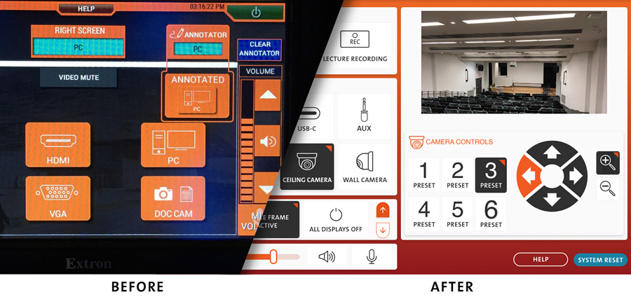
Design Solution
The new design considered all the issues with the navigation as follows:
- Designed new sharp icons to show actions/tools visually and added labels on the bottom.
- Removed black background and added white space.
- Organized the icons in rows, sections, and flows to add a visual hierarchy.
- Considered solid visual contrast between ON, OFF and an IDLE status for each task and projector.
- Built on overlays with caution messages or tips triggered when the user made a mistake so they can reverse the action.
- Added a Tips and Guide section as an additional resource.
- Implemented one button for direct access to IT.
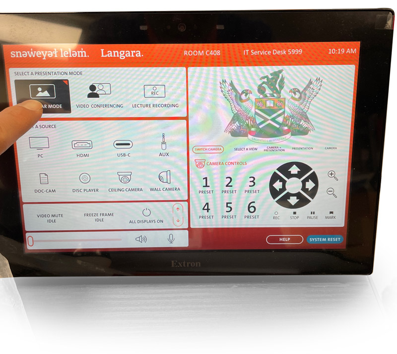
Results.
We launched the first User Interface in 2021. We continued to improve it. IT deployed the revised new interface at the beginning of 2022.
At Langara, we are committed to improving the user experience of our students and teachers at each point of contact. This new user interface provides an easy-to-use way to set up the classroom before any lecture or presentation. We are one of the first Colleges to have this customized Graphic User Interface in every room. Since we launched the interface, calls requesting help from IT have reduced dramatically.
We will continue to conduct user research, task analysis, listen to feedback and research new technology to identify deficiencies and improve the interface for a better user experience.
What we learned.
Testing always pays off. Doing task analysis and surveys allowed us to identify the user’s main pain points and help us provide a compelling user (teachers and students) experience design solution that responded to their needs and concerns. We will always advocate for prototyping, testing, and exploring design solutions before investing much time and money in development.