Objective.
- Identify issues and opportunities with the homepage design through research and analysis.
- Integrate our Musqueam name as part of Langara’s identity that conveys a sense of equality.
- Determine ways to promote Beyond49’s anniversary and events.
- Create an engaging design that reflects our evolving brand.
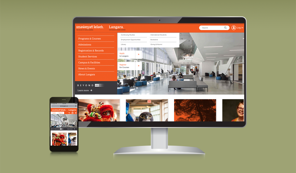
The Langara homepage refresh will endeavour to create a positive experience with our audiences, align the look and feel with our brand attributes and align the goals with the College’s 2020 Strategic Plan vision, values, and priorities. Visit the site
The hypothesis.
The Langara.ca homepage’s current design was outdated and has not undergone significant changes since 2011. Also, during this time, we got negative comments about weekly events getting missed by users because they were displayed in a small carousel for desktop only; it was not appropriate for mobile.
Role played.
Lead UX designer and main interviewer responsible for determining the overall design direction of the project, prototypes and final templates while collaborating with two developers, a communication officer, and the digital strategy and production manager.
Proposed solution process.
We analyzed traffic and behaviour flow (Web Analitycs, Heat Maps, Scroll Maps, and Confetti). We additionally conducted qualitative-personal interviews with faculty, students, and staff. We wanted to know what users thought/felt of our site after using it and their first impressions of competitors’ sites. Besides, we asked the interviewers to create a mood board about Langara by selecting five images from a pile.
Our findings: They thought the site was cold with no students in the images (campus life), the carousel rotation to promote the events was too fast, and the content too small, so they did not bother to read it.
Challenges faced.
We got a bit ambitious during the ideation phase and proposed some dynamic features such as adding this event to your calendar and date filtering; unfortunately, these features would not work within our current CMS platform.
Results.
After removing these features from the initial compositions, we designed a clean and visually appealing layout that answered the issues at hand and satisfied the user. As a result of these changes, the attendance to events increased, students now identify themselves with Langara’s campus life, and communication officers can now update the events more manageable.
What we learned.
I believe in prototyping, testing, and exploring design solutions. I design interfaces to be used by specific audiences. I have to ensure the interface seamlessly guides them to perform their tasks. This makes all the effort from our team worth it.