Background.
The Viewbook is an essential piece Langara uses to promote the college. Previously the college produced and printed two separate book publications, one for domestic and one for international students. About 35% of Langara’s student population comes to study from outside Canada.
Objective.
- Harmonize the viewbooks
- Design a concept showcasing a dynamic, welcoming, professional college with easy-to-find and read information.
Target Market
- High school (grades 10-12)
- Indigenous students in Canada
- Mature students for Continuing Education
- Parents looking for the best choice for their kids for further education and benefits Langara offers, such as co-op opportunities for children.
Role played.
Lead designer for the website and print version. My objective was to harmonize the viewbooks and present a dynamic, welcoming and professional college, with information easy to find and read.
Concept Solution.
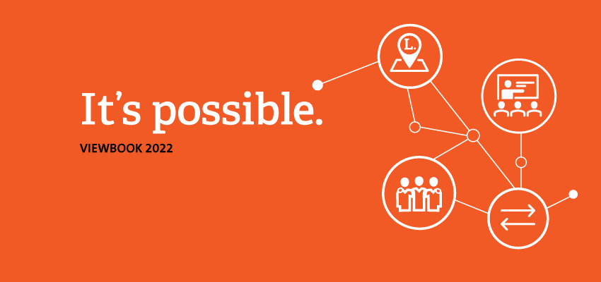
We identified a few obstacles for students to inverse in college education, so our central message to respond to this with a solid main message “It is possible.” To say it nicely, “come to Langara; we got you covered! We defined 11 reasons or benefits of why Langara makes it possible. To visually communicate this, we designed 11 icons that interconnect and have Langara as the central point. The icons have a varnish ink to add dimension and flow as they glow in the light.
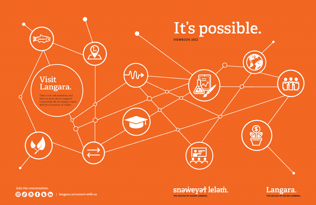
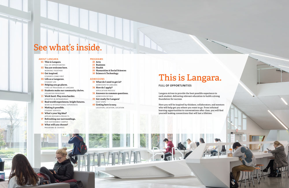
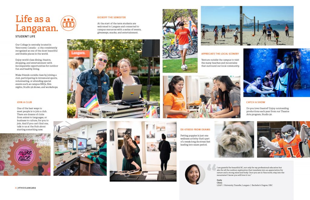
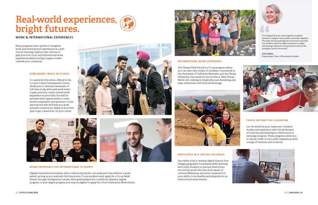
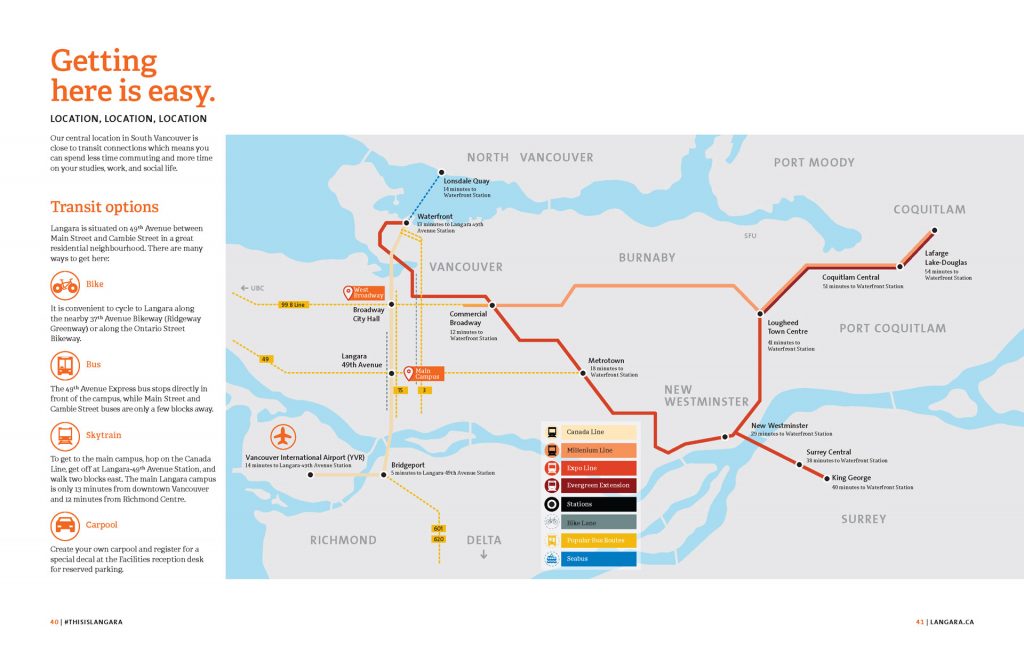
For the inside pages in the book, we defined a 12-column grid which provided consistency and structure. At the same time, each layout is dynamic and allows flexibility and variety from page to page. The spreads throughout the book showcase a vibrant, fun, and welcoming Langara. Each icon on the cover has a page in the book to connect the visual with the information. The last spread presents a handy and easy-to-read map that portrays one of the best features of Langara: Location, Location, Location. See the full viewbook.
These icons would work for any media, print or web, as the icons’ position is flexible to facilitate the design for vertical or horizontal assets. We can also promote each icon/benefit separately for ads or Instagram stories. The icons have a varnish ink for the print version to add fun as they glow in the light.
For the content, we added testimonials so that the communication feels more personal, from a student to a student.
Results.
Feedback from the recruiters
“It is functional, with perfect distribution of information (flow) with white spaces for the eye to rest. It is easy to use when showing it to potential students.”
—Recruitment Team
“We are proud to show this book; it is like our little treasure; we don’t give it away to everyone.”
—Recruitment Team
The solution (next steps).
Use the icons to promote Langara on different media channels, either in a group or separate per benefit.
Harmonize this print book viewbook with the online viewbook. Define a matrix with the assets needed for each channel before the design process. So that design is cohesive regardless of the media channel, the design process is more efficient as the design team can design with a plan in mind.