Escents Aromatherapy provides natural essentials for the body, mind and home with unique, industry-leading scent selections and the first-to-market custom blending experience.
Role played.
I was the Creative Director at Escents. I led and mentored the creative team and freelance resources to increase brand awareness and user emotional connection. I ideated, designed and produced pieces ranging from stationary material, packaging design, label design, print collateral, point of purchase collateral, web design/UI, illustration, and product photography. Below you will find some of my favourite projects.
- One box and six colours shining.
- 800 years of tradition in a bottle.
- Signs with an aroma to enjoy the journey.
- Showcasing a five-star product.
Perfume in a box
One box and six colours shining.
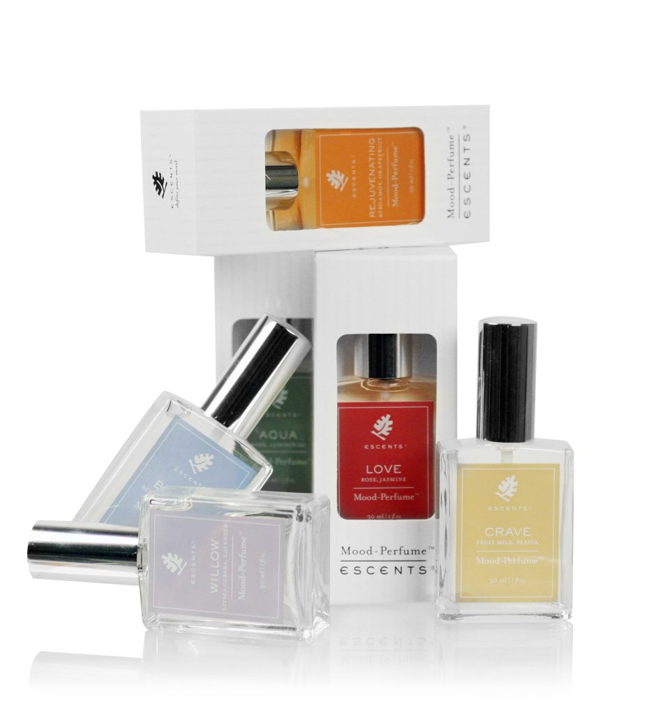
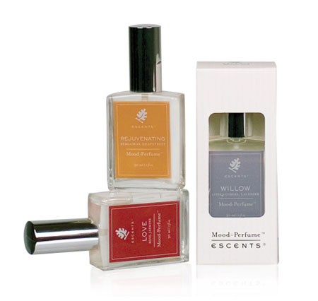
Escents needed labels and packaging design for its new mood-perfume collection with six different fragrances. After spending most of the budget on product production, we did not have enough money to create each perfume box.
The challenge was to design one package that looked different for each perfume, maintain the usual high-quality print, and stay within budget.
The solution was to design one box with a die-cut. The opening of the box will show the label creating the illusion that each package is different. To add a high-end finishing, we printed vertical lines on transparent varnish so that the box shined while you held the product in your hand or the sun was shining on them, making this a unique experience.
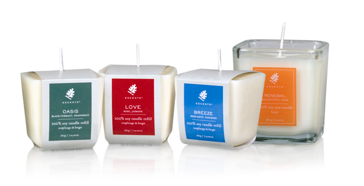
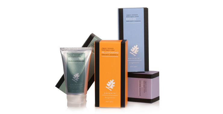
Matcha Collection Packaging
800 years of tradition in a bottle.
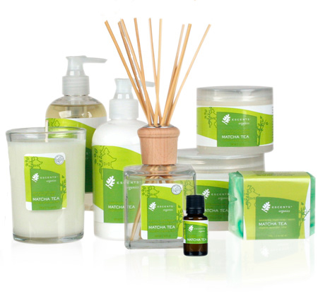
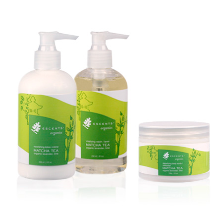
Escents needed a packaging design for its new Matcha Organic collection that consists of eight products– Lotion, Handcream, Natural Oils, Foot Scrub, Soap, Shea Butter, Diffuser, and Candle.
The challenge was to have a design that jumped out of the shelf and depicted organic while maintaining cohesion with the already established product line. In addition, the budget was limited, so the choice of spot colours was a consideration.
The solution was to make visually appealing the essential ingredient in this collection: Organic Japanese Matcha tea. The darker layer of green coveys the purity and quality of the Matcha tea, natural and organic. The lighter layer of green is not a straight line as they invite a sense of flow and organic, such as the smell of nature. Thus, we incorporated some Japanese motifs and a butterfly to symbolize spiritualism and beauty.
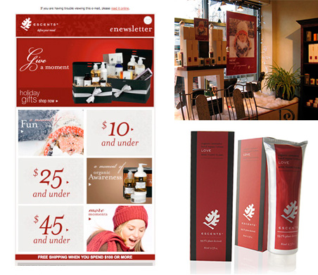
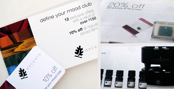
Point of Purchase Materials (POP)
Signs with an aroma to enjoy the journey.
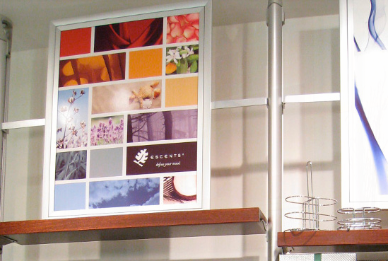
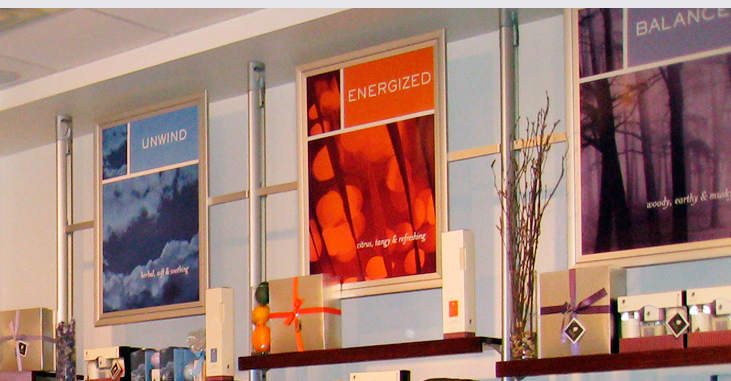
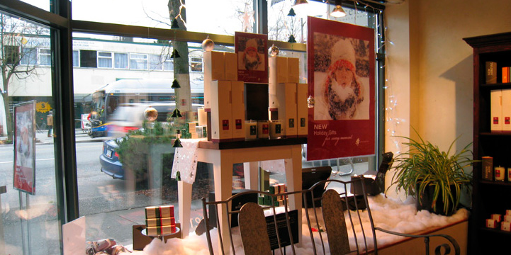
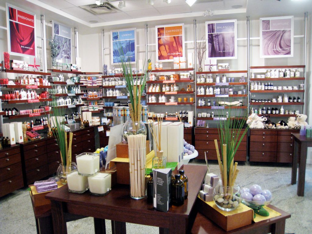
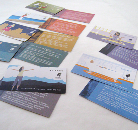
Escents has a wide variety of products and promotions, and featured products got lost in the noise. Escents needed new visual merchandising pieces based on the market’s unique demands, new store merchandising, and monthly promotions. The assets include posters, displays, tags, signs, product stands, shelf lips, vial cards, and flyers.
The challenge was to differentiate featured products in the store so they are easier to find. Make a visual flow. Guide the client through the store, and their shopping experience is more enjoyable.
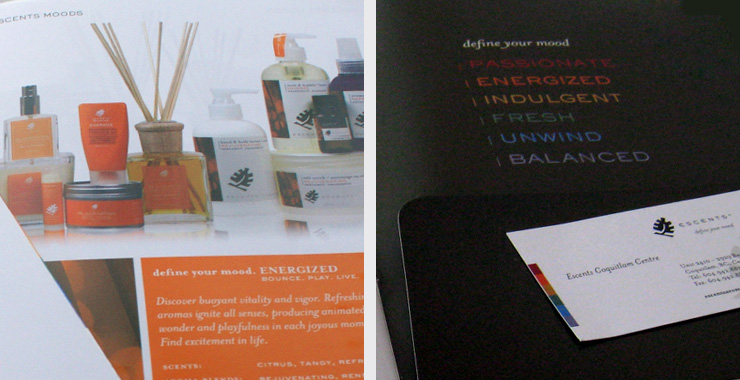
The solution, we revised all the current point of purchase pieces, maintained what worked, and created a guide standard manual and some signage hierarchy rules. In addition, we designed better collateral that was easier to assemble, display and discard. The stores looked more harmonious, and the products were easier to find. The visual merchandising pieces supported their eight stores and the wholesale market. Also, we introduced a new label design colour-coded and a booklet to get the most of the product and discounts.
Wholesale Catalog
Showcasing a five-star product.
The objective was to design an attractive and easy-to-use catalogue to launch the brand in the wholesale market, which exudes the Escents brand; we let the colourful product be the storyteller on a solid white stage. To make this catalogue functional, we did not include the products’ prices; they were on a separate price list, and they could be freely updated and printed on a regular black and white printer. The price list space was on the flap on the inside back cover. In addition, on the inside flap, we added business card slots so that the sales representatives could make this piece their own. We could have a more significant print run of the catalogue with these additions, save money, and not worry if the prices change. All the product photography was done in-house.
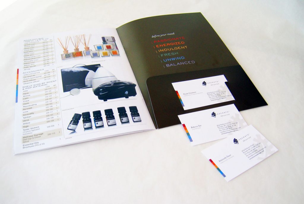
I designed new stationery material as the old one was plain and did not convey what the company is about–emotions, moods and quality. We subtle introduced colour to portray elegant energy and make it engaging. The choice of high-quality stock states the type of products they sell. And with short write-ups on the back of the business cards, one will discover Escents story.